Dev Log 2/3/26 || Formatting for Understanding.
- Trainer 117

- Feb 3
- 4 min read
For months now, one of the major hurdles I’ve been trying to jump is player understanding. Granted, the rate of “this does what?” has diminished, but it has been a prevalent question since day one. For the longest time, I thought this was a complexity issue: too many rules in one place, overloading players, meaning nothing sinks in. An issue I’ve done just about all I can without boiling everything down to shapes and colors, yet I keep hearing “This does what?” or some variation of it, again and again. At this point, complexity is not the issue; conveyance is, and if I want to get people to understand my game so they can play it and break it for balancing reasons, I need to make the core rules more digestible.
So that has been the name of the game in January. Currently, I have a draft of the rulebook done and floating about in circles where it can get some eyes on it, so as I wait for feedback, here is what I focused on.
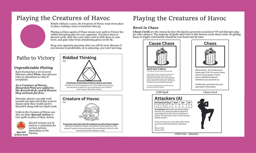
1] Minimal Text (To the best of my ability) – Rules text, while important for conveying vital game information, can turn intimidating really fast when blocked together. Hence, most good rule books keep important information spaced apart and alongside a corresponding image or example so the reader has something to tie the text with.
One good example (the prime example I used when laying out my book) is the Learning to Play guide for Root. That book is about twenty-eight pages long - smaller than the main rule book - and covers only the essentials of play in brief passages, accompanied by useful diagrams, examples, or images. Take the page on Battling. 2/3rds of the page is dedicated to what battles are, the steps in them, and how all players can do more damage in battles. At the same time, the remaining third is sectioned off from the text and includes a neat little example of a battle using game objects the players will interact with, with minimal text.

In total (outside of the example box), there are seven blocks of text, each no longer than five lines, with key steps or words in bold to draw attention. I tried my best to keep to this standard, but there are acceptations, and a few pages with five, five-lined blocks stacked on top of each other and nothing else, so there is room for improvement. At least the foundation is solid.
2] Use Game Objects in Examples – If you want a player to draw the connection between a rule and the game object that is attached to said rule, then put that object on the same page as the rule. This way, players know that when X condition triggers, Y game piece is affected. Root is full of these examples, but they can be found in every game, regardless of complexity. And it is why some more complex games are best explained through playing a trial round.
Magic: The Gathering has loads of specific card interactions when you get deep into any set. But the best way to start playing is with a Starter Deck, playing against someone who already knows how to play. This way, each phase on your turn can be shown and explained as it happens, walking new players through the steps and specifics of those phases. Also, by playing with a Starter Deck, you’ve controlled the number variables at play during any one turn, so new players can just focus on the fundamentals of the game: play land, cast spells, reduce your opponent's life to zero before they do it to you – simple, easy, intuitive.

Taking that spirit into my own game, I’ve tried to pair examples or game objects with their corresponding rules text as often as possible, and to keep to just the fundamentals of play so I don’t go off into the weeds too early. That second step, however, is the hard part, as I have to stop myself from going into greater detail, helping players along to the fun of the game so they can find it for themselves. The joy of playing MTG after all is finding a combo between a handful of cards yourself and realizing how they interact with the core rules on your own. A process that would be severely diminished if Wizards of the Coast printed a combo guide for every card in a given set, not to mention exceedingly expensive.
3] Basic Assets are better than no assets – I’m not an artist. I can not make anything that helps fill the page out or provides visual pop to an example. I do, however, have a selection of Vectors and pixel brushes that add a layer of professionalism to my rule book, which, while simple, are a whole lot better than a load of PNGs and text boxes floating around in a white void.
It should be noted that while skilled visual artists are nice to have, the tools they use are freely available to anyone. Sure, you might not know how to use all of them in the same way. But both a Carpenter and your average Joe can swing a hammer to pound a nail – the only difference is the speed and confidence with which one does it.
That’s about all there is to tell at the moment. Next on the docket is to do the same with the Unit cards while I wait for feedback for the rule book. I really, really hope that with proper formatting, I can finally put the player comprehension problem to bed so I can start testing mechanical complexity, utility, and other core ideas I wanted this game built around. You can’t appreciate a painting if it's not properly framed. It’s just somewhat aggravating that it's taken this long to find a frame.
Comments